This post contains affiliate links, meaning I may earn a commission if you click through and make a purchase. As an Amazon associate, I earn from qualifying purchases. This comes at no additional cost to you. I only recommend products or services that I believe will provide value to my readers based on personal experience or thorough research.
Color theory is like the secret sauce in character design. It’s what gives life to a drawing and what makes certain characters unforgettable. We’re talking about the why behind colors and how these choices aren’t random but rather intentional decisions that help tell a character’s story. Knowing your reds from your blues (and everything in between) isn’t just art school hassle—it’s crucial if you want your designs to really pop.
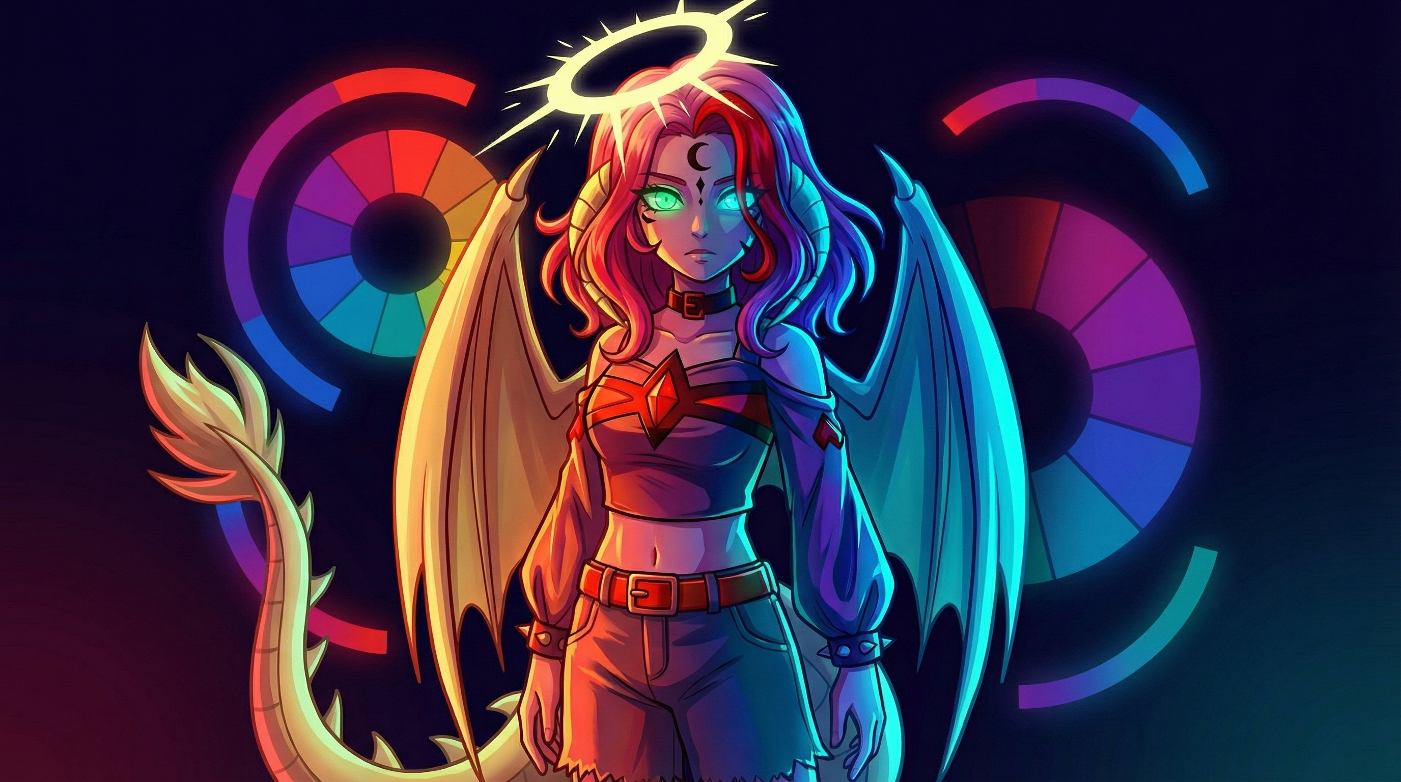
Straight up, the color wheel is where it all starts. Picture this: a circle with every color imaginable, sitting side by side their closest relatives. From primary colors (those OGs—red, blue, and yellow) to the mixes they create like purples and greens—this wheel is like a designer’s toolkit. It’s all about understanding relationships here. Like how opposites attract, colors across from each other on the wheel pack a punch when used together, while those hanging out side by side play nice and calm.
Using color wisely can totally change a character’s vibe. Think about how Batman’s dark palette instills fear, while SpongeBob’s bright yellows scream joy. It’s about matching a color to the personality or theme you’re trying to convey. This doesn’t just help in building a character from scratch—it also aids in maintaining consistency and depth in their on-screen or on-page presence.
It’s not just about making things look pretty, though. The colors chosen can set the mood, hint at a character’s backstory, or signal their role in the narrative. When you see a villain draped in black, you instantly get sinister vibes, right? That’s strategic color choice at work. The art isn’t just in creation—it’s in how these choices subtly communicate deeper meanings to an audience that might not even realize they’re picking up on these cues.
Whether you’re doodling in a notebook or working on a big project, understanding these basics in color theory sets the groundwork for more advanced design moves. It’s like learning to walk before you run. You start with these foundational stones, then step into more complex territory armed with a sharp eye and a well-tuned sense of color relationships.
The Psychology of Color: Emotional and Cultural Connotations
Colors aren’t just eye candy—they carry emotions and cultural meanings way beyond their visual appeal. When designing characters, tapping into color psychology can take your creation from bland to booming with significance. It’s the key to making audiences feel a specific way without even realizing why.
Take red, for instance. It’s fiery, passionate, and can scream danger. It might make you think of a hero full of action or a villain burning with rage. Yet, this same color in some cultures represents prosperity and happiness. Knowing these nuances can be a game-changer when you’re choosing a color for a character’s costume.
Colors can express a character’s internal state or even foreshadow their journey. Like, blue often shows up when a character is feeling calm, but it can also mean sadness, depending on the shade. A blue cape might hint at a superhero’s stoic strength or a sorcerer’s melancholic wisdom.
And let’s not ignore how different cultures see colors. White in Western cultures symbolizes purity, but in some Eastern cultures, it’s linked to mourning. As a designer, being aware of these cultural differences helps in crafting universally relatable or culturally specific characters.
Characters like Buzz Lightyear, decked in green and purple, hint at his futuristic, out-of-this-world persona. These lively colors aren’t just for flash; they mirror his adventurous, spirited character. The way colors make us feel and think deeply influences how we perceive such personalities.
Looking at famous examples gives a wealth of inspiration. From Maleficent’s chilling green and black to Elsa’s cool blues, it’s the clever use of color psychology that sticks these characters in our minds and hearts.
Using the Color Wheel: Crafting Complementary and Contrasting Palettes
So, you want to make a character pop off the page? The color wheel is your starting point. It’s not just for elementary school art class; it’s a powerful tool to create striking, memorable designs. It’s all about understanding how colors work together to create visual harmony or tension.
Let’s talk complementary colors first—those pairs lurking opposite each other on the wheel. Use them to bring out the best in both hues. Think of iconic duos like purple and yellow or red and green. These combos provide high contrast, making characters instantly catch the eye.
But harmony isn’t always about opposites. Analogous colors, which chill right next to each other on the wheel, offer a softer, more cohesive vibe. Picture a cool ocean with blues, aquas, and a hint of green. Characters sporting these shades can evoke calmness and peace.
When it comes to creating palettes, knowing when to clash and when to blend is crucial. The color wheel guides you in mixing it up. But keep balance in mind—too much contrast can be jarring, while too much harmony might fade into the background. It’s the right mix that creates lasting impact.
Take a look at some heroes and villains. Why does Joker’s infamous green and purple combo work so well? It plays brilliantly with complementary colors, amplifying his chaotic energy. Meanwhile, Superman’s blue, red, and yellow scheme rings true to his classic, all-American hero charm, balancing primary colors for instant recognition.
Whether designing for animation, comics, or games, the color wheel’s your trusty ally. Putting even plain-old color schemes for your characters through the wheel’s lens can turn a simple idea into something visually unforgettable.
Establishing Character Identity through Color
Colors aren’t just about looks—they’re like a cheat sheet to a character’s soul. Getting the colors right means we’ve already won half the battle in defining who a character is at a glance. The shades you pick influence how the audience connects and resonates with them.
Think about iconic characters we instantly recognize by their colors. Pikachu, with its bright yellow, is a perfect example. It’s not just vibrant; it lights up with energy, curiosity, and a touch of playfulness—all signature traits of this electric Pokémon. Color alone does a lot of storytelling work before any dialogue kicks in.
Using color thoughtfully allows you to spell out a character’s role without being too obvious. Does your villain wear ink-black attire? That convention isn’t just tradition—it’s psychologically programmed to convey mystery and danger. Conversely, heroes wearing bold primary colors like Superman project strength and reliability.
The choice of color can signal a transformation too. Look at Anakin Skywalker becoming Darth Vader. The transition from lighter tones to stark blacks is a visual cue to his character’s journey from light to dark side. This evolution wouldn’t hit as hard without deliberate use of color changes throughout.
Distinctive character palettes also help a character stand out among a sea of others. Think of Shrek’s unique green tone—it sets him apart literally and metaphorically in his tale of embracing uniqueness and breaking norms. Characters like these make a big splash with memorable color choices that enhance their story arcs.
The best part is being bold and experimenting. Colors impact design in ways we often register subconsciously. When you align a palette with a character’s traits and narrative path, the story naturally becomes more immersively compelling.
Balancing Aesthetics and Functionality: Designing for Diverse Mediums
Character design doesn’t stop with choosing colors. It’s about making those colors work across different formats, whether it’s a hand-drawn comic or a high-definition video game. Each medium comes with its challenges and requires flexibility in design.
In 2D animation, colors are often bold and flat, creating a clean silhouette and ensuring clarity in fast-moving scenes. The simplicity of these colors helps maintain consistency across various frames, ensuring the character remains recognizable in movement.
Switch over to 3D, and you’re looking at more than flat colors. Here, shading and lighting become crucial. The colors need to interact well with textures and light sources to add depth and realism. This might mean tweaking tones to prevent colors from looking washed out or overly saturated in certain conditions.
And let’s talk gaming, where characters exist in immersive worlds. The color palette needs to fit the environment and the mood of the game. A war-based game might call for earthy tones for realism, while a fantasy world might exploit brighter, unusual colors to depict magic and mystery.
Colors must also be accessible to everyone. Designing with color blindness in mind can ensure all audience members have an equal experience. Using high contrast and avoiding confusing color combinations like red and green can help in accommodating these needs.
There are great examples out there where designers have struck this balance beautifully. Characters like Lara Croft have transitioned through various game iterations and mediums, each time maintaining the core colors that identify them while adapting to the visual style of the time.
Adapting your color strategy across different mediums enhances a character’s appeal and helps them stay relevant and engaging, regardless of the platform they’re presented on.
Advanced Techniques: Beyond the Basics of Color in Character Design
Once you’ve got the basics down, it’s time to up your game with some advanced techniques in color design. This is where you can truly set your characters apart, pushing them from good to unforgettable.It’s not just about picking a color; it’s about playing with tones. Shadows, highlights, and gradients can give your character a more dynamic, lifelike presence. This depth can evoke mood and convey movement, which is crucial for adding realism, especially in video games or high-quality animations.
Then, there’s texture—the unsung hero of color perception. Textures can make a color feel soft, hard, shiny, or gritty, all contributing to what the character represents. Think about the slick shine of Iron Man’s suit versus the gritty texture of Batman’s armor. These tactile visual cues add layers to a character’s identity.
Don’t forget trends. Colors and styles in character design evolve over time with cultural changes and technological advancements. Staying updated with these trends ensures your designs remain fresh and relevant, tapping into current audience preferences while still being yourself.
Iconic characters don’t just happen by accident—they’re crafted with intention and skill, often evolving with technology and artistic trends. The use of vibrant undertones, unexpected color pairings, or even monochrome palettes can refresh a classic design or ground a new one. Characters like Spider-Man have donned different color schemes over time, each with thoughtful intention towards storytelling and audience engagement.
Craft your color story with intention. When you’re deliberate about your choices and not afraid to experiment and grow with their tastes, you create characters that stay with people long after the scene fades.
Hello,
This article really highlights how color shapes a character’s vibe and story! I’m curious, though—how do you strike a balance between using traditional color meanings and making a character feel fresh and unique? And when designing for different mediums like 2D animation or video games, does that change how you approach color? Would love to hear more about how you tackle these challenges in your own work!
Ah, the color game! 🎨 Striking that balance between tradition and uniqueness is like playing with a box of crayons—you’ve got the classics, but the real magic happens when you experiment! Here’s how I think about it:
Balancing Traditional Meanings and Freshness:
Start with the Basics: Traditional color meanings (like red for passion, blue for calm, etc.) are powerful because they tap into emotions people instinctively recognize. I usually lean on these as a foundation, especially for first impressions of a character.
Twist the Palette: Once the basics are set, I add a twist—like unexpected accent colors or shifting the shades. For example, instead of a classic fiery red, maybe use a muted burgundy or neon pink to convey energy in a fresh way. It’s like remixing a favorite song!
Tie Colors to Personality or Story: Instead of just going with the obvious meanings, I think about how the colors reflect the character’s quirks. Maybe a brave character wears yellow instead of red because their courage is rooted in optimism rather than aggression.
Experiment with Context: Changing the context can redefine a traditional color. For example, green often means growth or envy, but in a techy sci-fi setting, it could scream “glitchy and unpredictable.” Playing with context is where the fun really happens.
Adapting for Different Mediums:
2D Animation: Colors need to pop and read quickly, so I stick to bold contrasts and clean palettes. The lighting is usually more controlled, so you can lean on solid, vibrant colors that won’t muddy up.
Video Games: This is where it gets layered—literally! You have to consider how the character looks in motion, under dynamic lighting, or from multiple angles. I focus on colors that maintain their identity even with shadows and highlights. Also, the colors might need to signal gameplay elements (like red for enemies or blue for allies), which adds another layer of challenge.
Other Considerations: In games, you also need to think about how the environment impacts the character’s colors. For example, a bright palette might look amazing in concept art but could clash with a dark, moody game world.
My Approach:
When I’m designing, I love to do quick mock-ups for different scenarios. I might test how a palette looks in a sunny outdoor scene versus a moody interior or see how colors translate to movement (like animations or gameplay footage). It’s also super helpful to squint at your design—if the colors still stand out and the character reads well, you’re on the right track.
Honestly, it’s a bit of trial and error, but that’s the fun part! 😊